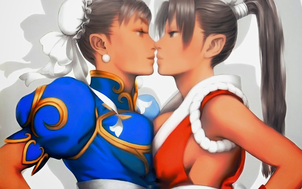
Those tits won't be necessary pt 1 of 8: Tackling Taki
[This is the First part of an 8 part series If you would like to check out the other parts, click on their respective numbers 8,7,6,5,4,3,2 Or if you want more in depth discussion, try the bonus chapters: The Myth of Selective Diversity, The Fat the Lean and Everything in between and Lingerie may not be armor (but it's as thin as your arguments)]
char·ac·ter·i·za·tion (kăr′ək-tər-ĭ-zā′shən)
n.
1. The act or an instance of characterizing.
2. A description of qualities or peculiarities: a list of places of interest, with brief characterizations of each.
3. Representation of a character or characters on the stage or in writing, especially by imitating or describing actions, gestures, or speeches.
Characterization in its basic definition is integral to Writing, art, illustration, animation and theater, and is certainly a core element to the overall narrative. A character driven narrative with no characters goes nowhere, obviously because the conflict can't be resolved due to no one to progress or resolve the plot (Yes, that goes without saying, but let's assume that this statement is intended for the layman). In Video games. character design is one of the most important elements taken into consideration during production. A good design can be seen as timeless and enduring, Two traits that can be infinitely beneficial to the popularity of a series, and if you don't believe that, keep in mind that Mario is one of the most recognizable characters in the world, even surpassing Mickey Mouse in popularity in the 90's.
 |
| it's-a me, bitches! |
Of course it's here that we come to the point of this article. Below is the (albeit rough) translation of an article from Swedish gaming blog, Svampriket about redesigning popular female fighting game characters. While, there's obviously nothing wrong with a good redesign, the reasons for these designs seem to be less about reinvention for the sake of experimentation and more a means of liberating female characters from the dreaded male gaze!
The deepest cleavage area, tightest pants, åmigaste poses and horniest attention in videogames is usually found among fighting accordion girls. While gambling houses over the years become better at being with playable female characters, they have simultaneously been consistently poor at giving them worthy outfits and reasonable body proportions. I refer not only to the real bottenskrapen as Dead Or Alive or Rumble Roses, but in almost all big names in the genre: Nina's purple jumpsuit with vaginasuspensoar (thoughtful) in Tekken, the generous gaze up into skreven which they later installations of Street Fighter bidding on or how SoulCalibur in each new game trying to outdo new vulgo record with Ivy's preposterous outfits.
While of course there are good examples, they are bad too many, and relaunched characters follow the same pattern as the already established figures return with the same tasteless and sexist character design in game after game after game ...
If you want something done properly, then it is just as easy to do it yourself, a motto I always kept - way too hard - on to.
So when I do, I give eight figures a makeover. I divide this project into three parts, for it is not just about putting on any one pair of leggings, it's about to take on the whole character.
first The bodies. They may be more reasonable proportions, balloon breasts and hip bones that can be cut in two with a loaf disappear.
2nd Poses. Away with the wobbly legs that barely looks like it could hold up the bulging breasts, asses and lips. No more tail thinking and Amande, these characters should stand firmly and not to smoke in sex.
3rd The clothes. Of course, we're going out and fight so you might want to take on something that works with your body and not against it. High heels may look great, but the fight is more practical to have to hit than on the feet.
I chose characters according to how interesting I thought they were, and whether I found something there to work with. So there are much worse examples of badly designed characters out there, but I chose eight of which I thought was worth a chance.
- NOTE! Before we kick off, I just want to say that I know this is not the most spectacular, cut and välritade I made ??during Reich flag. This is simple ink sketches scanned and then colored, fairly quickly, and they are by no means amazing in terms of technology. I still hope to produce my message, and you can take them for what they are: concepts. -

First up, we have Taki from Soul Calibur, whose apparent coolness should speak for itself, but that we most remember that she ninjar around in blue or red body stocking, with melon breasts extorted out of a small leather vest. A perfect character to begin with, for such large corrections needed to be made here. Ålskinnet was replaced with a classic ninja costume, and the breasts relegated appropriately enough inside the protective vest. Her accessories in general feels fitting and actually damn tough, but the mask had also become more "normal" ninja, and have less S&M vibes.

In Street Fighter has both Cammy and Guile a very militaristic style, with the slight difference that Guile rarely perform their duties wearing a thong bathing suit and softly camouflage painted bone. I replaced the aforementioned thong bathing suit against the jacket and pants. Revolutionary, right? Cammys obligatory "showcase its just butt" -pose abolished too. Beret, gloves and shoes, I kept as they were, but why not move up camouflage painting somewhere where it actually relevant?

This outfit and the design really gives us a maximum of everything. Darkstalkers Morrigan offers lavishly on both wrote that ass like breasts. Since she'll look like a classy character so I thought a long dress could be suitable, with a hefty slot for variable sake. I often thought Edea from Final Fantasy 8, a lady who was both stylish and sexy, but without being an object. Fixed Edea had not Morrigan amazing Batman leggings, a detail that certainly did not

One of gaming's get tranny, which at a quick glance might appear to be relatively well dressed. There's both linen and denim shorts, it's well after all, okay? Though it's a tank top that shows off just as much as a bra and a pair of denim shorts that are lost three wires from becoming a panty. Undone addition. But! We should not forget that poison actually have a riding crop and a pair of handcuffs too. Here, let me simply biker-style get improved on, jean panty got a couple of long pants, linen were full length and a leather jacket were also added. And something more practical shoes.

Here we have a design that dares to refuse underwear. Obviously. A strange but super charming bow with their trailers cost the other hand on it. King of Fighters premier lady is wearing a type of tunic that we recognize from before. Though they have porrat it down completely, so I simply took and restored it to the original design. And when I was at it so she got even a few hearty leggings, for those really high kicks.

Another Street Fighter character, Elena has a lot of potential to be really memorable, barefoot, white-haired and acrobatic. But wearing a bikini that seems to be made of bandages. I kept bandages theme, but let the bra become a top. The base had to be replaced by a pair of loose trousers, while I kept all her arm and benringar, and his bare feet.

More Darkstalkers, and this was the most difficult of the eight. I dislike general animal characters, whether they are uncomfortable over sexy or dumbed down gullifierade and Felicia succeed in some strange way be both. For tell me, how do you get an fur-stripes that looks to have been spun on the bare skin? There are some safe bets when it comes to making characters more tasteful, and one of them is to think retro and pick inspiration from bygone eras. So Felicia got a weak seventy fragrant disco look that could still retain some of her most important attribute, but toned down the "I'm-your-sexy-kitten-and-I-want-to-play-with-your-ball of yarn" thing .

Since I never have accepted the Guilty Gear so my knowledge of In-no fairly shallow. The obvious: she is an amazing combo of witch and rock star, but it is a shame that her bust burst down her top. Because there are plenty of fabulous female rock stars to take inspiration from - from Joan Jett to Karen O - so was a more modest attire is not difficult to sketch up. Even Ino has little S&M vibe, and the tinted I briskly down. Big plus for her guitar, better assecoar can not be found!\
The attitude must change, over all game genres, and not just in the fighting. When Tekken 7 recently släpte pictures of their new characters as they promise more of the same: A woman in bikini top and cat Lucky girl Chloe, and I'm too tired to even rolling his eyes.
Use your head
While this seems like an interesting article, A number of things prove slightly concerning when dealing with retooling of these characters. Of those issues are mainly the backwards sentiment that lead to the creation of the article. Let's start off with a bit of real talk.
 |
| Even realistically depicted mannequins are fit in Sweden |
Third, design isn't merely there for just aesthetic purposes. If a character is designed a certain way, there is some sort of logical reason behind it. However, with no research done to explore the reasons as to why a character is designed the way it is, it's easy to fall into the trap of "oh, it's just because of ______ !" Which is lazy not just on a professional writing standpoint, but as an artist as well. As a designer, you should be willing to analyze and deconstruct a design in order to break it down to it's most basic elements. Once this is achieved, you can take the information you discovered and put it towards some form of improvement of the design that feels true to the core of that character's personality. This doesn't mean change it for the sake of being offended, it means finding an alternate means of expressing the character's personality without sacrificing what makes that character themselves.
Fourth, An artist should not only respect the body types they have to work with, but also be inclusive of every possible body type out there. Especially those melon breasted, wide waisted girls whom from your actions, tell that you may not believe exist outside of the confines of your own personal and cultural scope . Being an artist, means you have to observe people of all walks of life and additionally observe the beauty that lies within.
Analysis in the front, Creativity in the back
Despite these protests, this isn't just an article about arguing with ideologues. That won't solve the matter of why these designs fall flat. The purpose of this multi-part article is to show the process of breaking down each of these characters to their core and offering insight into why they were designed that way in the first place. For this, we will be using one of the best resources on the web, as far as Fighting game character design is concerned. "How to design a street fighter character" was a thirty-part series posted on Capcom-Unity blogs by a insightful fellow named Big Mex. For the sake of consistency, we'll be using portions of that series for cross-reference. So let's start with the ultimate goal of designers when creating a character that will endure over multiple sequels.
The goal for budding designers is to try and create a Timeless Design. The challenge is that designers have to have faith that a design is not too boring or too bland. A mistake that many designers make is to try to appeal to trends and pop culture. While this satisfies the zeitgeist of the gamer it also betrays the potential for a design to be a long-term success. A designer should rather than ask if their design will hold up over sequels or revisions without feeling dated. Ken, Ryu and the other karate fighters are going to age well in the series because of the timelessness of their design.With that being said, Let's begin this deconstruction and analysis of characters deemed "too sexy" We'll cover the first on our list, here. The next seven parts will cover each character, breaking them down to their core, while comparing them to each redesign until we reach the conclusion. Today, we'll cover Soul Calibur's Melon breasted ninja, Taki. For the sake of argument we will be posting each statement to frame some of these changes properly.

First up, we have Taki from Soul Calibur, whose apparent coolness should speak for itself, but that we most remember that she ninjar around in blue or red body stocking, with melon breasts extorted out of a small leather vest. A perfect character to begin with, for such large corrections needed to be made here. Ålskinnet was replaced with a classic ninja costume, and the breasts relegated appropriately enough inside the protective vest. Her accessories in general feels fitting and actually damn tough, but the mask had also become more "normal" ninja, and have less S &M vibes.
 |
| Dynamic as eff! |
At first in conclusion, there certainly female Ninjas had existed in the Japanese history. Their appearance can be found in the esoteric writing about Ninja called " Bansen-shukai (萬川集海) " , written in Edo-period. But there are no records at all which insist female Ninjas were as active as male Ninjas.
In Bansensyukai,female Ninjas are called " Kunoich i" .In Japanese, " Kunoichi " means "nine plus one ". The interpretation of this phrase is that, a woman biologically has "ten" = "nine plus one" holes in her body comparing with a man who has nine holes in his body like eyes, ears, a mouth…. But today, the meaning of Kunoichi is considered that "Kunoichi" is the separations of a Kanji (漢字) , which expresses about " woman (女, おんな ,onna ). The letter "女" can be devided in three Japanese words. They are " く(ku) " , " ノ (No) ", and "一 ( Ichi ) ". However this interpretation is only the influence of " Yamada, Futarou (山田風太郎 ) " , who is a famous historical novel writer. He often used this expression in his works. In this connection, male Ninjas were called " Tajikara ". In Kanji, the letter that indicates a man is " 男 ( おとこ otoko ) " . This word can be also separated " 田 ( た, ta ) " and "力 ( ちから, chikara ) ". So, they are "Tajikara".
According to the historical records, Kunoichis did neither fight nor do flashy espionage. Their main role is to be maids of their enemies. As they invade their hostile residences legally, from the casual conversations with another maids or servants, they pick up secrets information. Generally speaking, people are not cautious about women.Kunoichis take advantage of it.
And Kunoichis adopted such tactics. After they had worked for their enemies and got credit by the people around them, they demand their masters to bring burden from their parents'home.The burden is packed in a big cage, and the box has dual-bottoms. On the lower bottom, a male Ninja is hiding. In this way, a Ninja can sneak into the hostile castle. Eventually, maids are given the period to go back their hometown a few times in a year. Of course, their guarantees are their Ninja masters.Then, Kunoichis can tell their bosses about informations which they had got in hostile residences.
In principle, the jobs of Kunoichis are the supports to male Ninjas, Kunoichis sometimes act indipendently (sic). It is when they utilize a weapon as a female. In short, Kunoichis sometimes sleep with their enemies and try to bring out secrets. Hopefully further, Kunoichis may be able to control even their enemies by obsessing them with sex. For that purpose, it is said that beautiful girls in a very juvenile age were chosen to educate them to be Kunoichis. Such kind of tactics is not so unusual that we can find it in any eras. This is so called " Honey Trap " . But in this case, the problem is that, Kunoichis sometimes take a liking to their enemies seriously. It is said that for such a situation, Kunoich needed to be watched. It is common for any period that man always has to be cautious for a woman's mind.So historically, it can be said that Kunoichi used sex as a weapon in order to distract their targets, and thus achieve their goals. It's something that's been used in various media, including the 2003 Shinobi series game, Nightshade (which was named Kunoichi in Japan), 2005 video game, Red Ninja: End of Honor, As well as the 2011 titled movie starting Rina Takeda
despite it being said that Kunoichi weren't known to fight along side male ninja, movies like the one shown above, comics, and television show them battling against other ninja, the supernatural, and varying opposing forces. This is what brings us to Taki's background, which is been lifted from Wikipedia ( We're doing this on the good fortune that no one would be dense enough to edit war a fictional character's origin story for political agenda, but then again, it's entirely possible. ).

As in the case of all Soul characters, Taki's character creation started with her weapon.During the early development of Soul Edge, Taki was conceived as a Yoshimitsu-like ninja character, armed with a long sword and wearing a loose outfit and large helmet covering her upper face. She underwent several major design changes before the game's release, evolving into an athletic, iron-masked, buxom woman with a chest size of 90 cm/E (Soulcalibur IV measurements; her breasts have noticeably grew through the series), clad in a partially armored catsuit. Taki used variations of this outfit throughout the series; by default her primary costumes were colored crimson or navy blue. A cloth mask returns with Taki's primary costume in Soulcalibur—the only game in which her breasts are partially exposed—and an iron mask with her blue-colored main costume in Soulcalibur III. A similar red costume is featured in Legends Other demonic motifs have appeared on her armor since Soulcalibur.
Taki also wears some alternate costumes, such as her green attire in Soulcalibur II, which was modeled after an outfit worn by Waya Hime in Bravoman and Namco × Capcom. In it, she appeared for the first time with loose hair instead of her usual ponytail. Her hair is also tied back in her Soul Edge alternative costume. Until Soulcalibur II, Taki only appears unmasked in some of her alternative costumes, but in this game and in Soulcalibur IV she is unmasked in all costumes. In Soul Edge, one of the secret characters is "Nugi Taki", an alternative version of Taki who is unmasked, has short hair, and wears a unarmored blue bodysuit with a mesh shirt underneath. Soulcalibur III director Katsutoshi Sasaki described her as his personal favorite character from the series.The game's producer Hisaharu Tago said of her appearance in Soulcalibur V, in which Taki is depicted as over 40, "In terms of her outfit, we don't know if she'll be in body tights."One artist said he "got in trouble with Nintendo for showing Taki’s tits too much and had to slide her down for decentcy [sic]." Bayonetta's character designer Mari Shimazaki created the "SC Woman" alternative costume for Taki in Lost Swords that was inspired by superheroine costumes in American comic books and has been made available in a limited offer in October 2014
 |
| and you thought her default costume was revealing... |
Taki's height is 170 cm (67 in) and weighs 55 kg (121 lb) (later 53 kg (117 lb)). Her original weapon in Soul Edge is a ninjatō, called Rekkimaru (Rekki-Maru), which she made by infusing it with mystical powers. This is her preferred weapon and is one of the few original weapons that have not been replaced in subsequent games. Her secondary weapon, the kodachi Mekkimaru (Mekki-Maru), formerly property of Yoshimitsu's deceased clan, was added for her dual-wielding style in Soulcalibur as the lower blade on her back. Though Taki uses a single weapon in Soul Edge, Mekkimaru was featured in this game as an unlockable weapon. Her other optional weapons include a jutte, a kunai, a tantō and a bladed iron fan. Immediately after the release of Soulcalibur V in Japan, the game's director Daishi Odashima said that he had decided that at 46, Taki would be too old to be an active ninja, and she retired to train the next generation and is now watching over her pupil Natsu from the shadows.
Taki was one of the first two characters confirmed for Soulcalibur III and the ninth playable character confirmed for Lost Swords. She was officially described in the latter game as "one of the most versatile fighters of the SOULCALIBUR universe" due to "her unarmed & armed skills, demon huntress abilities and blacksmithing abilities." In the series of wallpapers pairing Namco and Capcom characters in Namco × Capcom, Taki's Capcom equivalent was Chun-Li from Street Fighter.
Taki's mask, which the writer thought gave off "S&M vibes", was commonly used by Samurai warriors to hide both the identity and the emotional state of the warrior as well as scare the ever loving shit out of their enemies. Taki's mask in particular looks to be the mouth of possibly a tigress or a lioness ready to engage in a heated battle.
 |
| You're probably peeing yourself, right now! |
In extensive research on color theory, we find that women seem to be attracted to cool reds which lean towards violet, which may explain the color choice (besides the lighting making it seem that way). Her secondary color is blue with a hint of gold trim. Both are really good contrasting colors to help to make the red more prominent. When looking at Taki's blue color scheme, the blue and black are good together, and there is enough of a complimentary purple there to make the costume stand out, but it just doesn't have that punch that the red costume has. This leads one to wonder if this is why it was redesigned to something more visually striking for Soul Calibur IV.
The catsuit itself appears to serve a functional purpose, due to it's form fitting design. Let's use gymnasts for example. A Gymnast wears leotards during training and performance for logical reasons; mainly they are comfortable and allow for a wide range of dynamic movement. Leotards are also minimalist in the use of fabric, so it allows the exposed portions of the body to "breathe" when exerting energy. This is also shown in Taki's Costume via the exposed arms and mesh portions, As well as Hibana's costume in Nightshade, which also features a similar design.
 |
| You better not be staring at my ass, Baka! |
In retrospect, Taki has a really clean design. It's not muddled up in intricate details, and has a lot of elements that originate from Ninja, but doesn't entirely ape the traditional Shinobi Shozoku. In fact, if we were to take this and compare it to Big Mex's notes about proper character design, it would fall in line, perfectly.
Now let's compare that to what the writer came up with.

Altered version of a traditional Shinobi Shozoku, check.
mesh on arms, check
Solid color scheme, check
shoulder and leg armor , check
The problems, however are the fact that the overall design seems rather bland and generic. We've added a vest for the sake of what's perceived a sense of covering up her bust, and adding some form of protection, but all it does is draw your eyes to her bust. Which is the opposite effect than the one desired. If we go back to the official Taki art, you'll notice that despite her large bust, the costume acts as an arrow leading your eye to her face (The trim around her bust creates an arrow shape that your eyes trace upwards). It's a very subliminal trick, but quite effective.
|
 |
| Open and still functional |
Ibuki's design brings up another point. The color. her costume shows enough contrast between the mask color and the muted Taupe to make her color scheme at least seem interesting. In comparison, The blue is clearly the dominant color in Taki's redesign, but with the addition of the vest, the blue doesn't seem very exciting. In fact the color of the vest does nothing to improve the overall color scheme, nor does it contrast enough to make a difference.
 |
| Just enough skin for those cold nights... |
I had mentioned in previous blogs that the best SF character designs were the simplest and most "pure." These characters all looked like fighters first and foremost before any other elements were placed on them. The mistake that some designers make is that simply creating a character dressed in traditional fighting garb is enough to make them work in a fighting game. A character in a traditional costume does not make them an archetype. It is possible to make a character look too generic, to play it too safe and lose the quality that made the character unique. For example, a recent version of Akira from Virtua Fighter, whose gi (karate uniform), headband and foot guards were white and plain seemed very generic. That newer costume choice lacked the contrast elements that made the earlier models of Akira and his rival Jacky seem unique.So what would be the solution to find that "happy medium" between the two characters? For starters, if we did away with the closed vest and actually kept the Shokozu top slightly open, but not enough to expose too much cleavage (or even add a leotard underneath the open Shozoku), we might have a good base to work with. Open the sides of the pants and add some contrasting color to those knee guards and shoulder guards. The addition of a scarf could of been better used to not bring attention to the bust, while adding a splash of color to the overall design. Strider Hiryu, Hanzo and Galford come to mind, here. While doing your own redesign of the character, keep in mind as well that the design has to fit into the overall universe of the character, meaning that your character should easily fit within the world of Soul Calibur.
In closing it should be said that The most confusing part of her Taki redesign is how she could have a ton of different facets Japanese Culture and other game characters, but choose the most generic option, possible. In giving the writer the benefit of the doubt, we can easily assume that time constraints, would keep her from coming up with something more meaningful, but let's be absolutely honest, here; This was the efforts of someone who clearly did not do their research.
It's not over, though. This is merely part one. We have seven more characters to go. Stay tuned for our next vict-er Fighter in part two.
Game On!


this is incredibly silly
ReplyDeletei'm here for entertainment, and as a reason to have tits in games I believe that is a knock-down argument, especially considering that the telos of games is entertainment.
In conclusion, to design a character is more like to make a research for a project than to just put random concepts on the table. It is very clear that the most competent designers are those who are the best researchers when getting inspiration for their characters; the main basis of a characters is useful as a guide for the research...e.g. if a want to design a character that is an imp creature then I must research about what is an imp, how an imp behaves, why imps are so popular in mythologies, how can I make my imp character be original compared to other characters, etc. and that reseach can not be something treated like nothing...you really have innovative and/or reasonable points...
ReplyDeleteI have found more redesigns of Street Fighter characters, and the redesigns belong to the newcomers for Street Fighter V and Blanka, a very classic character. Also, I have found other designs, and those designs are for a project called Sound Fighters, whose main inspiration is the SF Franchise and musical genres...it is about musical genres as fighters.
ReplyDeleteThe two links: https://keanemar.myportfolio.com/copy-of-reimagined-characters
http://drawander.blogspot.com/2013/02/sound-fighters-remix-project.html